Case Study – Alison Champion


Details
Clients
- Clix4U, Marketing Agency
Location
- Carlton, Australia
Involvement
- Brand Development for the Campaign
- Creative Direction
- Style Guide
- Campaign Material Designing
Alison Champion, the first Sherbourne Ward Councillor elected in 2019, approached us for assistance in developing a cohesive brand for her re-election campaign. Alison was also serving as the Mayor of Banyule at the time, making it crucial to establish a strong and consistent public image to help her stand out from competitors and address key community issues.
Project Goals: The primary objective was to create a unified visual identity and voice for Alison Champion’s re-election campaign. She needed to differentiate herself from competitors, connect effectively with her constituents on community issues, and address any negative publicity. Our aim was to:
- Develop a clear and visually appealing brand identity.
- Create a consistent voice that resonates with her target audience.
- Design campaign materials that highlight key issues.
- Implement strategies to handle negative PR and promote Alison’s work in the community.
Challenges:
- Standing Out from Competitors: Alison needed to differentiate herself from other candidates and ensure her key messages resonated with the voters.
- Managing Negative PR: There was negative perception from a segment of the community that needed to be addressed and countered with positive messaging.
- Communicating Key Issues: Effectively identifying and conveying the most important community issues in a way that engaged target voting audiences was a critical part of the campaign.
Results: The new brand identity and campaign materials effectively conveyed Alison Champion’s platform, helping her connect with voters in a meaningful way. The consistent voice and modern visual style set her apart from competitors, while the campaign material allowed her to reach her target audience through both traditional and digital channels. With her new visual identity and well-crafted messages, Alison was able to counter negative perceptions and present herself as a strong, reliable leader for the Banyule community.
Solution: To address these challenges, we focused on brand development and strategic campaign materials. We began by identifying key community concerns and shaping strategies around them. Through brand workshops and roadmapping sessions, we developed the following:
- Brand Pillars and Visual Identity: A new visual identity was created, centered around clear brand guidelines and a strong logo. The style guide focused on key brand values such as connection, empathy, integrity, and accountability. The logo incorporated a 7-pointed star, symbolizing strength and agility, and was designed for versatility across various campaign materials.
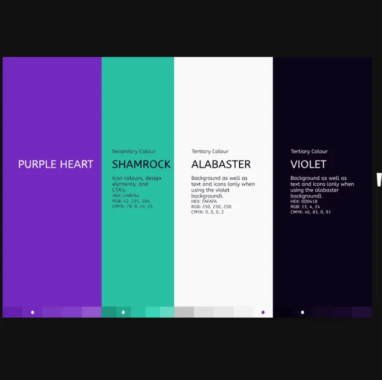
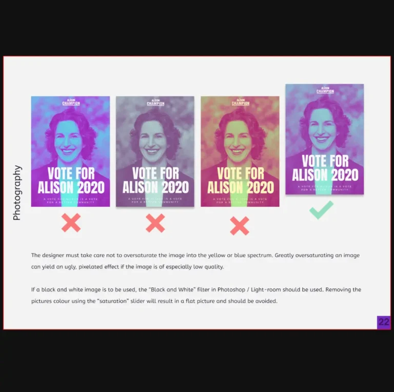
- Campaign Creative Direction: Using the visual identity, we designed vibrant and modern campaign materials that stood out from traditional political campaigns. A minimalistic, yet bold aesthetic was chosen, with a purple and green color palette to differentiate Alison from competitors while conveying professionalism and trust. This color scheme was applied consistently across all materials, from social media posts to printed flyers.
- Strategic Messaging: We worked on defining the core messages for the campaign, aligning them with Alison’s mission to create sustainable communities and empower residents. Messaging focused on her track record and future goals while addressing key community concerns such as the North-East Link project and local environmental issues.